6 Essential Principles of Sign Design
February 1, 2022
You can always tell if something looks off. You may not be able to explain what it is or how to fix it but there’s something not right. Hopefully, this is not the feeling you get when looking at your own sign. But if it is, keep reading to learn 6 essential principles for a great sign design.
#1 – Keep It Clean
Less is more when it comes to signs. In other words, keep it clean and easy to read. We understand that your business is the bee’s knees and you want to tell the world, but your sign is not the place to do it.
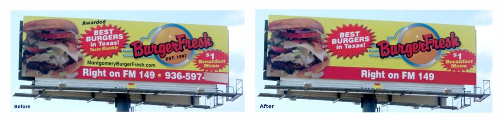
To illustrate this point, take a look at the first billboard. As you can see, there is too much information competing for your attention. Your eyes don’t know where to go so they bounce around absorbing little information. You can easily improve this billboard by removing unnecessary details like the established date. With a few simple edits, it is much easier to read and comprehend as seen in the second picture.
#2 – Easy to Read
Legibility and readability are essential to a successful sign. “You just said that I have to keep it clean and simple. I only have my name on there”. Yes, good job limiting the amount of information but consider the font you are using. For example, calligraphy has been trending for the past few years but can be difficult to read i.e. lack of legibility. Notice how the sign on the right is much easier to read. You can keep the flair but balancing your design with a clean font for secondary text creates a better layout.

#3 – It’s All About the Space
First, look at the space you have to work with. Does your logo work within that space? Is it the best use of that space? This is why having a few variations of your logo on hand is essential. Typically there’s a horizontal and stacked version that addresses space restriction. In addition, also having different variations for dark and light backgrounds will set you up for success with any color restrictions that might pop up.
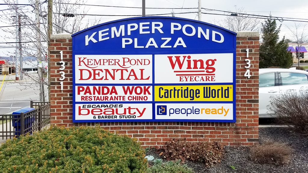
Another basic design principle is to use clear space or margins around the main element aka your logo. This increases readability. We get it, you want to be seen but making your logo as big as possible isn’t always the answer. Check out the photo below. Notice how the businesses on the left side use the entire space allotted. It becomes a big block of text that is hard to read. Furthermore, the copy is in red which is a big no-no in the readability book, but we’ll get to the importance of color in the next segment. Now look at the right side, these businesses leave small margins which make reading a breeze.
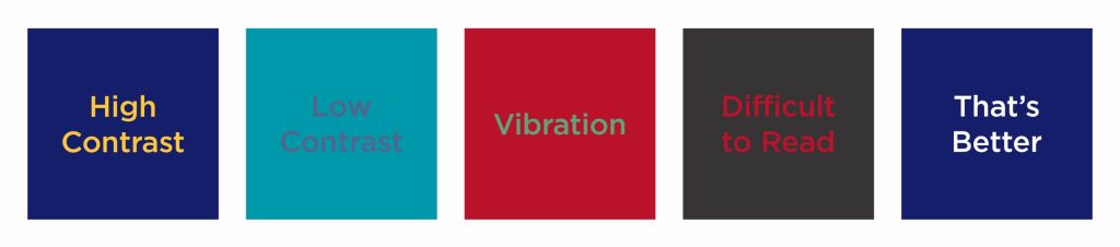
#4 – The Importance of Color in Sign Design
Color is one of the biggest factors to a great sign design. First off, the color of the main content must have enough contrast against the background. If the colors are too close, your message can get lost. Secondly, the color combination must work. There are colors that when put on top of each other will give you a headache and no one wants that. Here are some examples of what works and what doesn’t.
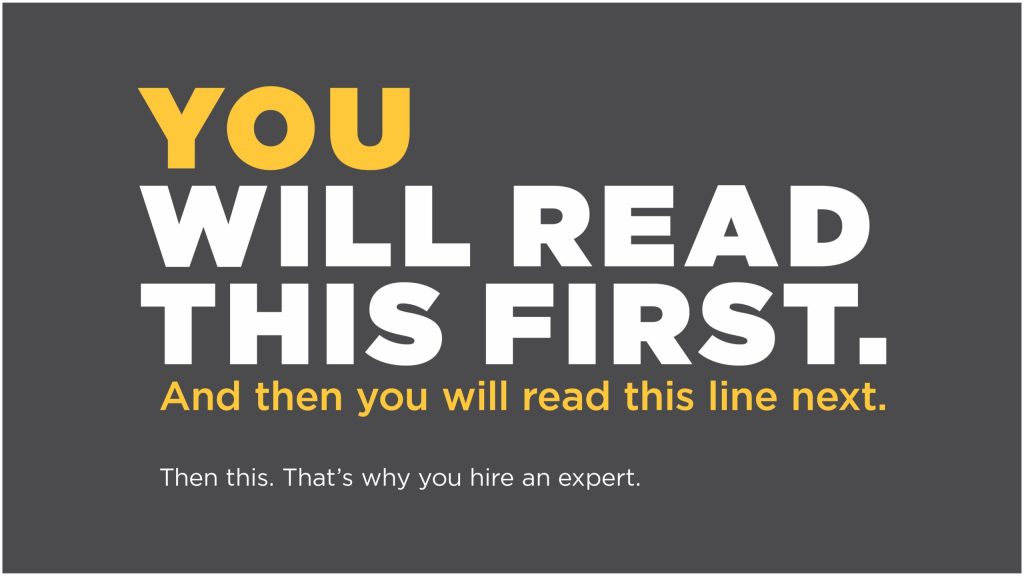
#5 – Respect the Hierarchy
Visual hierarchy is about drawing attention to the most important element of a design by using size, color, and composition. The image below is a great example of using size, color, and font weight to create a hierarchy. You instinctually know what to read first and what comes next. Learn more about visual hierarchy here.
#6 – Consider the Environment
When designing a sign, you must consider where it’s getting placed. Is it a pole sign that needs to stand out along a busy road or is it a digital sign in the hall of a high-end hotel that needs to conform?
In the example below, Zaxby’s pole sign really stands out on a busy road with its unique shape and contrasting colors. To gain additional attention, channel letters are used on top of the sign cabinet creating dimension and an electronic message center is placed below catching every eye. Now that’s a good-looking sign!
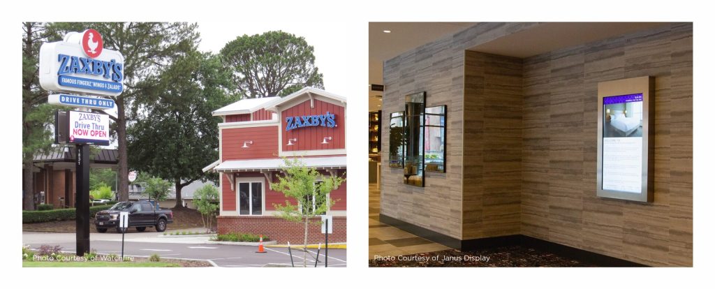
In the other example, we see a digital sign located in a hallway of a luxury hotel. This establishment prefers its signs to be noticeable while matching its overall aesthetic. It is designed for someone on foot who can get close, unlike the pole sign where it’s seen from moving vehicles. That’s why thinking of who and how someone is looking at your sign is important.
Now you have some tools and techniques to start designing! Go put them to good use or you can always contact us to help design one for you.